


Contents
Or read the White Paper below ...
When you walk into your favourite high street store expecting to find a specific product but it’s not available in your size, or your colour, there’s no sales assistant to be found and you can’t find any suitable alternatives easily… the chances of you buying anything that day are going to be pretty remote. In addition, it is highly likely, unless you were having a particularly bad day, that you would ever come back.
The exact same problems will happen with your eCommerce store if you don’t carefully consider the User Experience (UX).
Considering that the whole point of having an online shop is to acquire more visitors, convert those people into paying customers, increase order values and then persuade them to come back and buy again, you need to think about the UX and the journey they will take from initial landing on a page through to the checkout process.
The primary reason people still go to physical shops is because customers don’t have the ability to touch and feel the items they want to buy. This is a huge disadvantage for online retailers so delivering an amazing user experience is even more important.
Step one is to choose a best practice eCommerce platform like Magento or Shopify Plus as these platforms will allow you to deliver the UX you desire, and make the customer experience easy, convenient and fun.
Let’s take a look at some of the other more important elements for UX in eCommerce.
First impressions are crucial for online stores, as it’s often so easy for customers to find a multitude of other merchants who sells the same or similar products to yours.
Therefore, your homepage needs a lot of attention. Consider using inspiring images, videos and content, such as your brand’s history, etc.
Share how your company is different from the hundreds of others online and combine all this with simple, easy to understand calls to action, encouraging visitors to delve deeper into your site. It’s not just about your homepage however. If your site is well indexed in the search engines, over half your traffic will be coming straight into your category and product pages so it is just as important to take the same considerations into account for those pages as well.
Top eCommerce sites generally offer collections of items to guide users in their journeys. For example, they may feature a grid with all of the most popular men’s shirts, or they may offer recommended products based on past customer experiences.
The goal here is to allow for filtering and comparing when users look at these grids. Why? The galleries and collections of products are only suggestions. Once the user decides they would like to continue past your preset galleries, the filtering and comparison tools come into play.
The average documented online shopping cart abandonment rate currently sits at 68.63%. This is rather high, and it shows that the most successful companies are not those that rely on converting first time visitors into buying customers. This is where you need to think about customer engagement.
Customers need to be fed ideas before they even make their first purchase from your company. Consider solutions to bring back abandoned cart users and bounced visitors. These solutions will also work for buying customers.
Best practice email marketing platforms will allow you to:-
In addition, consider the following:-
Does your website feature any testimonials/reviews? If not, how are you going to build credibility with your customers? Do your product pages have ratings and reviews? If not, how are your customers going to see which of the items are best?
Consider solutions like Reevoo, Feefo and Trustpilot for reviews but also consider platforms like Olapic for user generated content.
First impressions are nice, but most customers are going to have some sort of question, it’s wise to have customer service links that are impossible to miss.
Companies often leave customer service links in the footers. Live chat boxes also come in handy, as customers have questions and being able to answer them as soon as possible is key.
Along with a secure checkout, a fast one is the second highest priority on your list. With eCommerce platforms such as Magento and Shopify Plus, both aspects of the checkout come hand in hand. Testing with customers is the ideal way to structure how your checkout process goes.
The ideal situation would be to have a one-click checkout, so aim for this. However, other elements are involved, such as guest accounts, which are shown to improve the amount of purchases on a site.
Customer want to be able to use their payment gateway of choice, especially with the growth of Mcommerce (Mobile Commerce) so consider adopting a number of different payment options such as Amazon Pay, Android Pay, Apple Pay and PayPal alongside your normal payment gateway to give them this flexibility.
This part ties into establishing a system to bring users back to your store, but it’s more about how people feel after they buy from you. For example, do they have links in the thank you page or order confirmation email to contact your customer service team?
Is there a quick and easy solution for returning items and printing out a return label without any problems? Can a modification be made to an order before shipping? It’s common for companies to forget about UX after a sale has been made, but it becomes all the more important if you want them to come back and buy from you again.
It doesn’t matter how dull your products may seem. Customers always want to see dozens of photos. From close-ups of a jacket buttons to more of a lifestyle image of someone wearing the product.
You can’t dismiss high resolution images because they further close the sensory gap between walking into a store and shopping online. Be careful however to consider site speed when uploading your images and make sure that they are properly optimised or they could cause a poor user experience.
Responsive design is now common place and if you don’t already have a responsive site, you need to get one fast. There are a lot of factors to take into account when moving from a large desktop view to a mobile view and vice versa, so here are some key design tips to create a great mobile user experience:
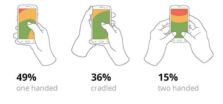
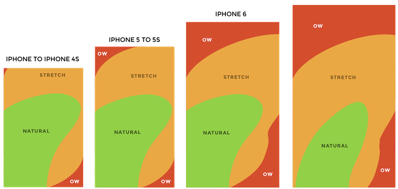
85% of observed users working with their phones used one hand. The following heat map shows the sorts of the thumb zones applied to every iPhone display size since 2007. You can see that the bigger the display, the less easily-accessible the zone is.
From the initial first impression to stunning product images, the most important parts of UX for eCommerce are sometimes complex, while other times easy. We recommend doing your research to see your customer’s activity and behavior. By make just one or two changes could making a huge difference moving forward.
If you would like to chat with us at Screen Pages about your eCommerce store, then get in touch and speak with our professionals.
Screen Pages has extensive experience in this field. We employ certified developers and solution experts. Our designers understand usability and eCommerce best practice in many verticals ranging from fashion, homewares and gifting to charities and B2B online retailers.
For further information on how we can help you, please call 01932 359160 or email [email protected]